
Here is a question for you: what is your favorite color?
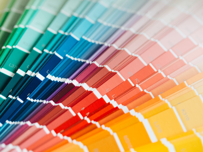
Maybe you have a favorite color or maybe you don’t. Or maybe, you have more than one favorite color. But if you do have a specific color you call your favorite, chances are you don’t like all shades of that color. Some shades will appeal to you more than others.
This shows how personal color is and why it is so hard to decide on the best colors to paint a rental property. Every prospective tenant you show the home to has the colors in mind they would like it painted in. And you, the owner, will also have your ideas of how the home should be painted.
Individual color quirks is the reason you should know the basic rules for choosing colors for your rental property. Though we often take them for granted, Pillar Management explains, colors have the ability to make a rental home massively attractive or completely repugnant.
This is because color is not a passive agent. It has the power to directly affect people and evoke all kinds of emotions in them. While you think of colors as just paint on the walls of the home, those colors are playing a role in the overall success of your rental.
How should you paint your rental property? What are the best colors for the various rooms and spaces in the home? Are there any rules or factors to keep in mind when painting the home? This post will provide answers to the questions.
Three fundamental rules for choosing rental property colors

Rule #1: Avoid bold and unusual colors
When choosing paint colors for a rental, your personal preferences must take a back seat because you are not going to live in the home. Bold and daring colors, though nice from an artistic viewpoint, force people into a “for or against” decision. You don’t want potential renters to have to choose if they love or hate the colors. Along with garish colors, you should avoid anything associated with specific groups, regions, or ideologies.
Rule #2: Aim for mass appeal with neutral colors
Most people do not have a “love it or hate it” relationship with neutral colors. Even if a renter does not particularly like the colors, they can still live in the home because they also don’t hate them. Moreover, painting the home in neutral colors will make it easier for tenants to fit their personal décor items into the design. Also, neutral colors will make a space look bigger and brighter; a great selling point for your property.
Rule #3: Use paint that hides dirt
If the colors you use in the home show dirt easily, you will have to repaint the home sooner than you want to. That will cost you money you don’t have to spend, and time you don’t have to waste. Painting the rental in shades that disguise dirt will help you avoid this problem. But this is not to say you should paint the home in unattractive colors like mud brown. If you combine a darker shade (versus light shades) with a paint sheen that is washable, you will have achieved the result.
Suggested paint colors for your rental property

Now that you know the ground rules for choosing paint colors in a rental, what are the best colors to use for the home?
Gray, tans, and creams
These three colors will work for most rental properties. When using gray, though, stay with warmer tones; lighter hues are somewhat cold.
Dark neutrals
If grays, tans, or creams are not your thing or you would like colors that make a statement, then you should try dark neutrals. But these are best used away from the living room or as accent colors for baseboards, doors, and walls.
In the living room
For living rooms, it is best to use combinations of neutral tones and warm colors. This will create a simple color scheme that offers a plain canvas for the renter’s decoration ideas, while still giving the room character.

In the kitchen
The color you use in the kitchen depends on the floor plan of your rental. If it has an open floor plan, stick with the color palette for the living room. But, if your home has a closed floor plan, you have room to experiment. The basic way to paint a kitchen is to alternate light colors between cabinets and countertops.
In the bedroom
Bedrooms will benefit from a minimal paint design; cluttered color schemes make it hard to relax and fall asleep. Slightly warm neutral colors are best for the bedroom.
In the bathroom
Like the kitchen, bathrooms will benefit from a little adventure. Adding bold touches to the overall neutral palette will add sparkle to the bathroom.
Avoid stark white
This color won’t provide needed contrast for hanging pictures and art on walls. Stark white walls don’t look good in online listings and the walls will show dirt quickly
Trackbacks/Pingbacks